Using the Results Grids
Many of the results you will see throughout the user interface (UI) rely on lists of data. Whether that is a list of scan jobs, scan results, exploit results or reports, the use of these list views are presented in much the same manner as a spreadsheet. There are instances where some features or functions are unique to a specific tab or page. In those instances, help will be found in the applicable section of this documentation. However, this section is intended as a primer on the basic layout and features found consistently across the UI and to provide a single location for presenting how these grids function.
The following shows an example of a data grid for the Analyze tab, and shows the results of a recent scan job.
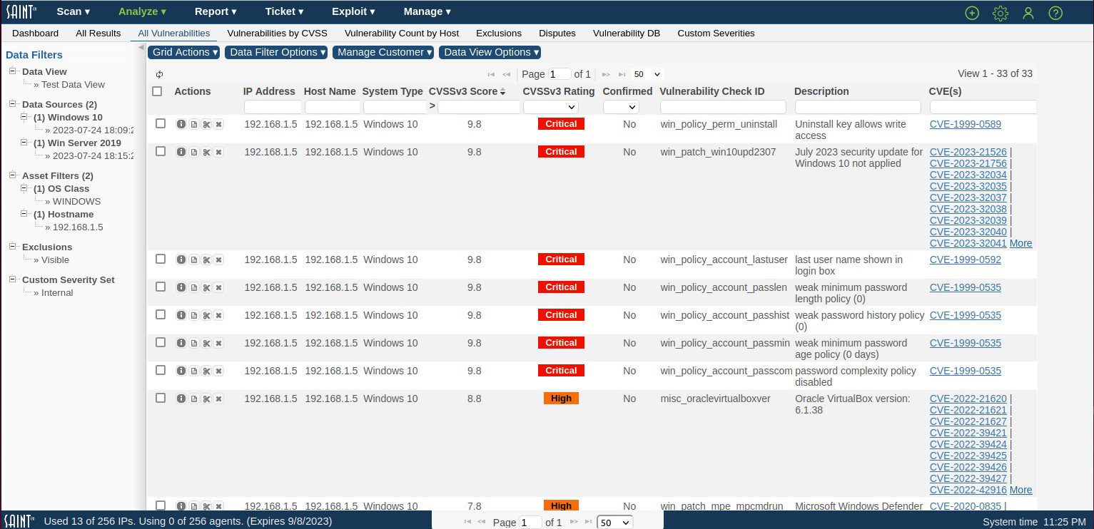
As shown in the example, results can contain text; numbers; images that may portray color and text alternatives that highlight a key data point; Boolean values (yes/no) that communicate whether a result is true/value, exists or does not exist; and also hyperlinks from a displayed value to an internal or external reference. Each grid may also contain buttons or icons on the row to offer additional information about a row’s content; as well as additional options t5hat effect the selected row, as described in the Grid Actions section.
View a Record’s Details
Some results grids only show a subset of the total number of available fields/columns for data being displayed. In most instances, there are two methods for viewing all information for a record. First, you can click on the Information (i) action of the record you wish to view. Alternatively, you can double click on the record to see further details.
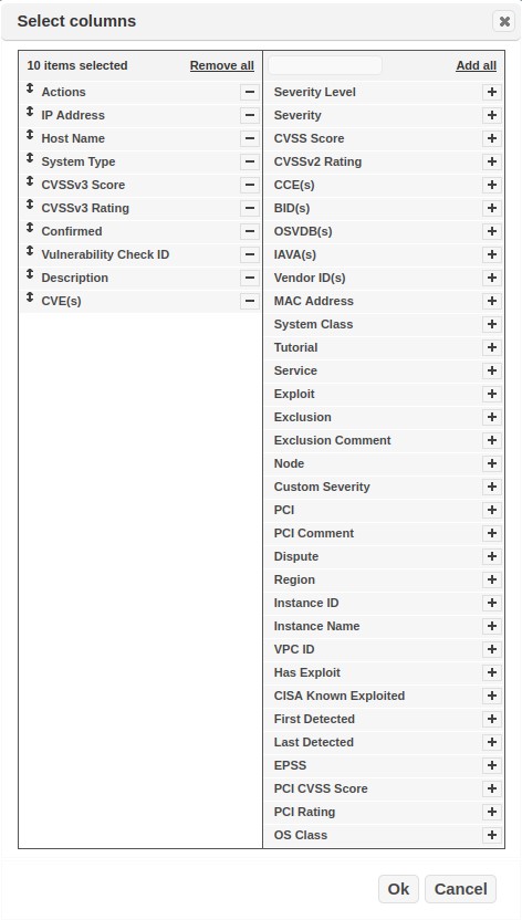
Column Selector
The results grids provide default column values based on the information relevant to the chosen tab. However, you can choose the columns to be displayed by clicking the column selector in the Grid Actions dropdown menu. The column selector will then display the columns currently selected in the left side of the pop-up, and other available columns (if applicable) in the right column. Use the (-) sign to remove a column from the grid and the (+) sign in the right column to add columns. You can also add all columns quickly by clicking on the Add all option.
You can also click and hold your mouse button on a column in the left column and drag it up/down to reorder the columns (drag a column up to move it to the left in the grid; drag a column down to move it to the right in the column order.)
Column Sorting
You can also sort data in a data grid (ascending and descending order) by clicking on a column heading. Clicking the heading again will re-order the data in the opposite sort order.
Column Search and Filtering
The grid feature also provides the capability to filter data content by a value found in a specified column. There are two ways to filter data.
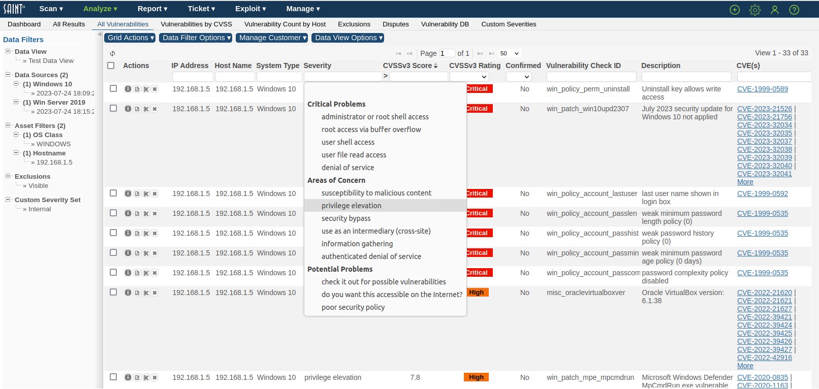
The first method is to select a value from a column’s drop down list. The example below shows filtering scan results for the selected scan data, by vulnerabilities based on "privilege elevation."
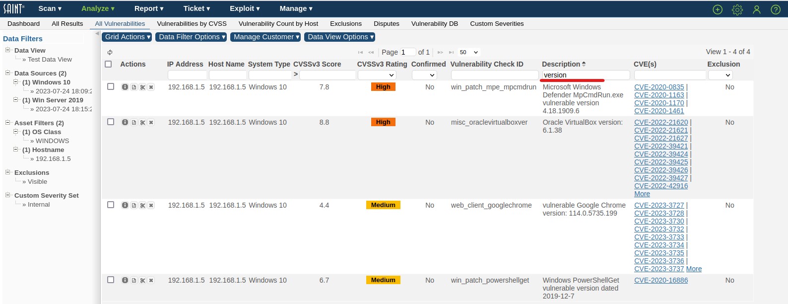
The second method is to simply type a value in the column search field. The following example filters the scan results to display only hosts and vulnerabilities based on issues with the "version" as in Vulnerable version:
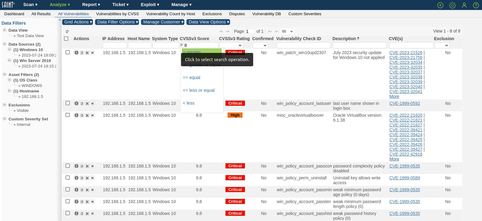
Some columns have optional search operators next to the search field. Entering a value in the search field and selecting an operator allows further control of filtering. The following example filters the scan results to display only records with CVSSv3 score greater than “8”.
Navigating through Results Pages
Every grid displays the total number of results retrieved for a given result; as well as the total number of rows per page, and number of pages that contain the results. Each grid provides a convenient method for managing large data sets by displaying only a limited number of records per page, and providing page navigation arrows to navigate between pages. All results grids also give you control over the total number of results to display on a page by selecting the total number of pages from the drop down list to the right of the paging arrows, as shown in the example below.

Note that the bottom blue toolbar is persistent, in that it is always visible to you as you scroll up and down with the grid. The top grid paging controls are contained within the grid header. However, the blue toolbar enables paging without having to scroll to the top or bottom of a grid to locate the controls.